

A well-designed interior is all about layering. Mixing colors and textures helps the space feel well unified and not bland or boring. Today I’m sharing 3 reasons why you should consider adding a lil’ something’ somethin’ to your home.
#1 – Varied Hues for a Healthy, Happy, Vibrant Home
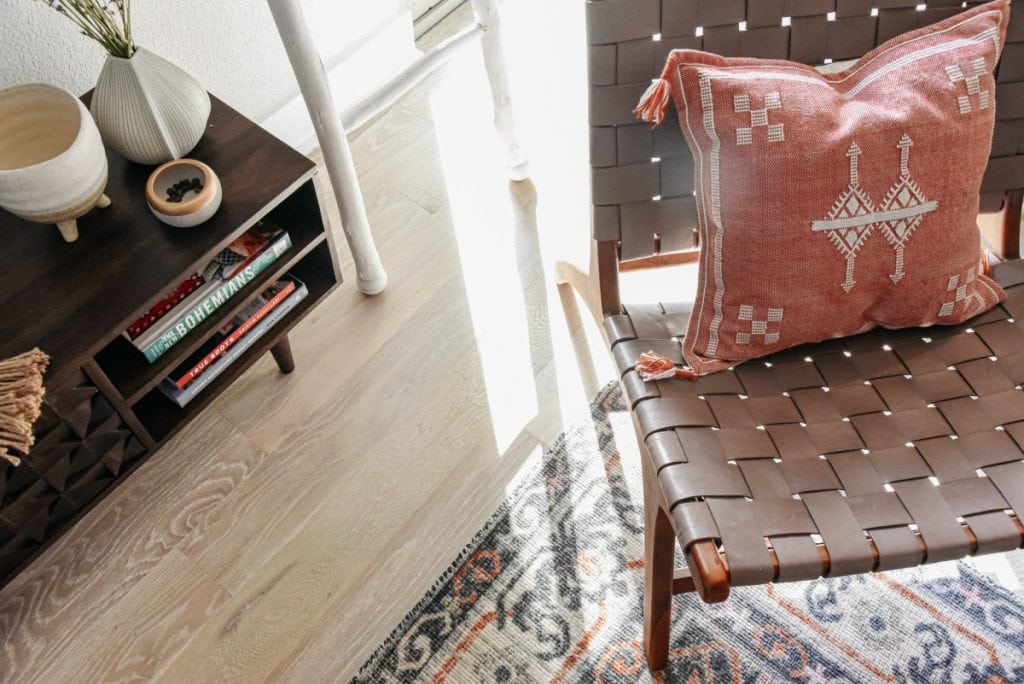
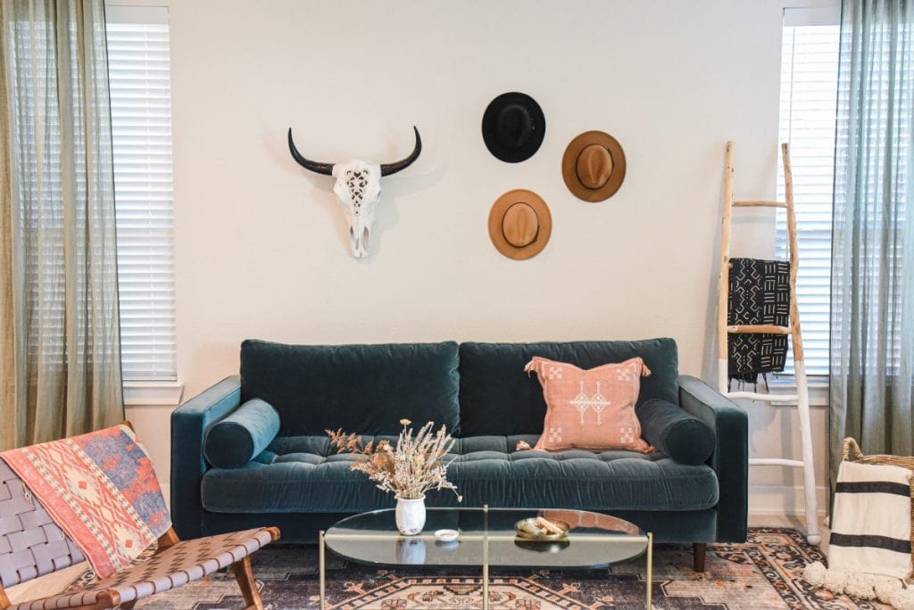
There’s a classic color theory study that was done way before I was born about how Mcdonald’s using red and yellow as their brand colors was all done on purpose. Bright colors such as these are said to induce hunger and anxiousness-so you go in, spend money, then leave. Hence why Ronald was able to have such successful biz. On the other hand, cool tone colors such as light blue and lavender are said to induce feelings of calm and relaxation, notice how so many day spas use these in their interior? Bedrooms are a great area you’d want to use cool tone colors in and a living room would be a place to make more inviting. By adding in interesting patterns you also provide a talking feature which again is great for a living or dining room.
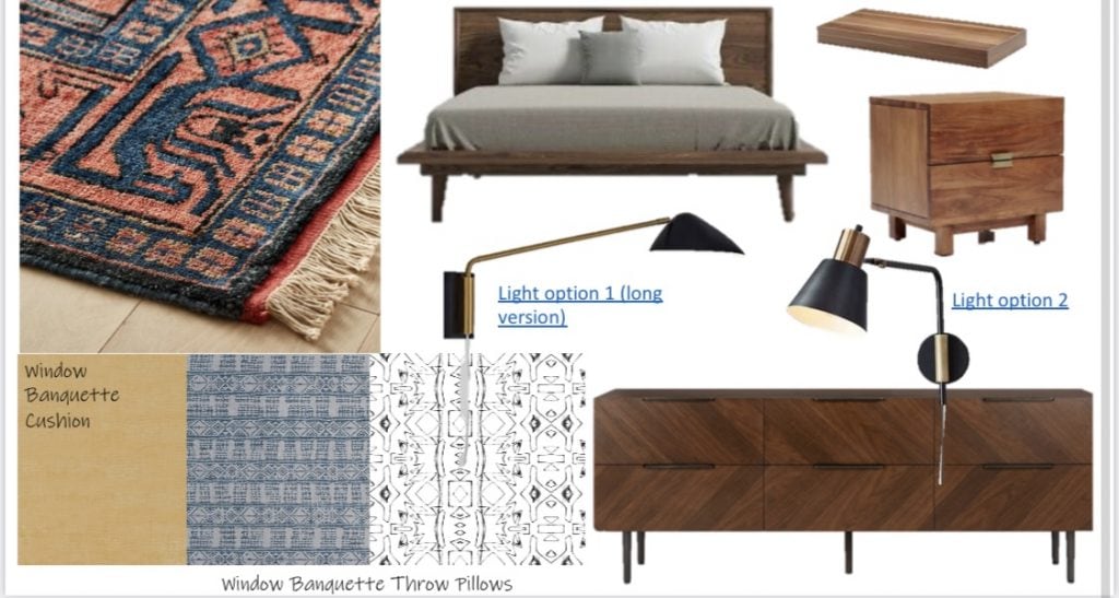
 Design by KozyKasa Photo by Rebecca Murphy
#2 – Plentiful Patterns for a Stunning Space
You don’t want to go overboard with one color though, so try adding in an accent color through throw pillows, fabric patterns on draperies, area rugs, etc. Having a mix will make the space feel lived in, relaxed, well designed, and more you.
#3 – Blending Colors & Patterns for a Harmonious Home
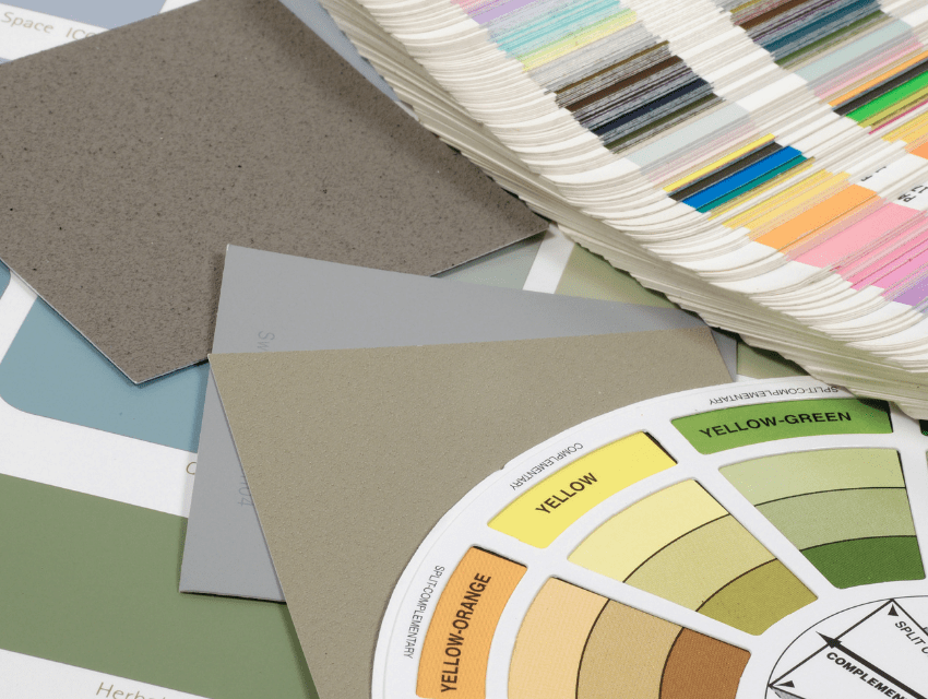
While it’s important to bring personality into every space in the home, it’s important to keep all the rooms semi-cohesive. This will help make the entire home feel well designed and not chaotic. One of my favorite color combos (lately, ha) is mustard yellow and sage green. Done recently for a Kozy client I looped in leather accents for the texture and made sure to incorporate different patterns in the same color tones throughout.
When I ask clients what kind of music they listen to in our initial design meeting they usually look at me like, huh? But trust me! This is a great indication of someone’s personality and helps me to understand what type of vibe they want in their space. Since interior design is so personal (we are designing your living space after all) it’s really important to get to know the client and gain a deep understanding of their wants, wishes, and ways they plan to use the space. All of this is taken into account when pulling together a color and texture palette for your design.
For a brighter, more colorful home (and inbox!), sign up for our monthly newsletter. The palettes and patterns we share are sure to inspire you!
Stay Kozy,
Kristin